Design Systems Are Not Just for Big Companies
Small teams benefit from reusable decisions even before they have reusable components.
Small teams benefit from reusable decisions even before they have reusable components.
Small teams benefit from reusable decisions even before they have reusable components.
When people hear the phrase "design system," they often imagine a large enterprise with a dedicated design operations team, a complex component library, detailed documentation, token management, governance meetings, and dozens of product teams trying to keep everything aligned.
That version exists.
But it is not the only version that matters.
A design system does not have to start as a massive internal platform. It does not need hundreds of components or a full-time team maintaining it. For many small businesses, startups, agencies, consultants, and lean marketing teams, a design system can begin as something much simpler:
A shared set of decisions.
How headlines work. How buttons are prioritized. How much space sections need. How service cards behave. How forms handle errors. How testimonials are presented. How calls to action appear. How pages maintain a consistent rhythm.
Those decisions may sound small, but they create real leverage.
A good design system helps a small team move faster without making the website feel chaotic. It saves attention, reduces debate, improves consistency, and makes the brand easier for visitors to understand.
That is why design systems are not just for big companies.
They are for any team that wants to grow without reinventing the website every time a new page is created.
Consistency Saves Attention
Every website asks visitors to interpret what they are seeing.
What is important? What can I click? Where should I look next? Is this section related to the last one? Is this company organized and credible? Can I trust this experience?
Consistency reduces the effort required to answer those questions.
When typography, spacing, buttons, cards, forms, and page patterns behave predictably, visitors spend less energy understanding the interface and more energy understanding the message.
That matters.
A website should not make people relearn the design on every page. If a primary call-to-action button looks one way on the homepage, another way on a service page, and a third way on the contact page, the visitor may not consciously notice the inconsistency. But the experience feels less polished.
Design systems protect attention.
They help visitors recognize patterns quickly. They make pages easier to scan. They reinforce trust because the site feels intentional rather than improvised.
For small teams, that is a major advantage.
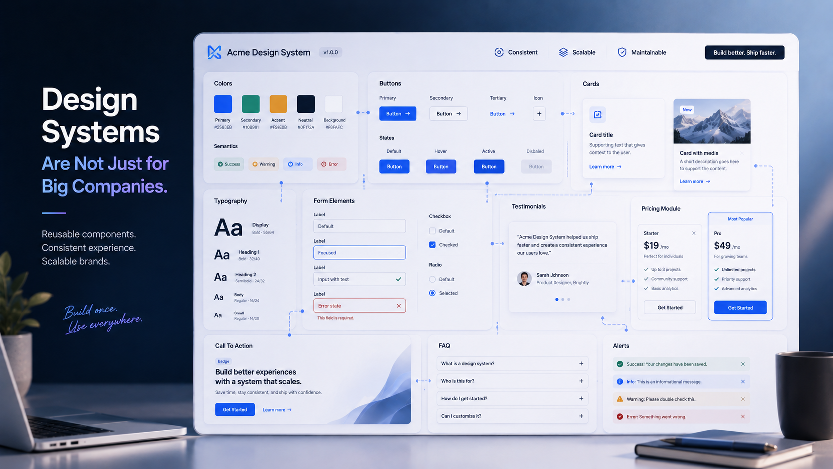
A Design System Is More Than a Component Library
A design system is often mistaken for a library of reusable interface components.
Components are part of it, but they are not the whole system.
A practical design system includes reusable decisions: type scale, spacing rhythm, color roles, button hierarchy, card behavior, form states, icon style, image treatment, section spacing, content patterns, navigation rules, call-to-action placement, accessibility standards, and voice and tone guidance.
These decisions shape the entire experience.
A component library answers, "What can we reuse?"
A design system also answers, "How should this feel, behave, and communicate?"
That distinction is important for small teams because they may not need a large technical component library right away. They may simply need enough structure to stop making the same decisions over and over.
Without a system, every new page becomes a fresh debate.
Should this headline be larger? Should this button be filled or outlined? Should this card have an icon? How much space should go between these sections? Should this testimonial include a photo? How do we show proof? Where does the call to action belong?
Those debates seem harmless, but they add up. They slow down publishing. They create inconsistency. They make the website harder to extend.
A small design system gives the team a starting point.
Small Teams Feel Inconsistency Faster
Large companies often adopt design systems because they have many teams working across many products. Without shared standards, everything drifts.
But small teams have a different reason to care: limited capacity.
A small team cannot afford to waste energy recreating basic patterns every week. It cannot afford design decisions that only one person understands. It cannot afford a website that becomes harder to update with every new campaign, service, article, or landing page.
In small teams, inconsistency usually appears quietly.
One landing page uses a different button style. One service page has a different heading structure. One case study uses a layout that cannot be reused. One form handles errors differently. One pricing section introduces spacing that does not match the rest of the site.
At first, these differences seem minor. Over time, they make the website feel patched together.
A lightweight design system prevents that drift.
It gives the team a shared language for decisions before the site becomes difficult to manage.
Start With the Repeatable Moments
The easiest way to build a design system is to start with what already repeats.
Most marketing websites use the same types of sections again and again: hero sections, service cards, feature grids, proof blocks, testimonials, case study previews, pricing tiers, FAQ sections, contact modules, newsletter signups, call-to-action bands, logo strips, process steps, and comparison tables.
These are the moments where standardization creates leverage quickly.
The goal is not to make every page identical. The goal is to make repeated decisions reusable.
A hero section might have three approved variations: one for the homepage, one for service pages, and one for articles. A testimonial block might have rules for quote length, attribution, and layout. A pricing module might define how tiers, features, disclaimers, and calls to action should appear.
Once these patterns are named and documented, the team can move faster.
Instead of designing from scratch, they assemble from known building blocks. Instead of debating every detail, they focus on the message, offer, and audience.
That is where a small design system starts to pay off.
Name the Pattern Before You Scale the Pattern
One underrated step in design systems is naming.
A pattern becomes easier to use once it has a name.
"Primary CTA band" is clearer than "that blue section near the bottom."
"Proof block" is clearer than "the testimonial and stat area."
"Service card grid" is clearer than "those boxes we used on the services page."
"Decision FAQ" is clearer than "questions at the bottom."
Names create shared understanding.
They also make documentation easier. A small team does not need a hundred-page design system manual. It can begin with a simple reference that says:
Here are the patterns we use. Here is when to use them. Here is what can change. Here is what should stay consistent.
That alone can improve the way a team works.
When patterns have names, people can discuss the site more clearly. Designers, developers, writers, marketers, and business owners can talk about the same thing without guessing.
Documentation Does Not Have to Be Heavy
Small teams sometimes avoid design systems because they assume documentation will become a burden.
It does not have to.
Good documentation can be lightweight and useful.
A practical small-team design system might include a typography guide, a color role guide, button usage rules, spacing examples, a few page templates, a set of reusable sections, form behavior notes, accessibility basics, voice and tone examples, and content rules for common modules.
The documentation should answer the questions the team actually asks.
It does not need to describe every possible edge case. It does not need to become a museum of design theory. It should help the team make better decisions faster.
A design system is successful when people use it.
That means it should be easy to find, easy to understand, and easy to apply.
A System Should Preserve Personality
One fear about design systems is that they make everything look the same.
That fear is valid when systems are built poorly.
Bad systems flatten every page. They reduce design to rigid templates. They remove nuance. They make the brand feel generic. Every section becomes predictable in the worst way.
Good systems do the opposite.
They create enough consistency for the experience to feel coherent, while leaving enough flexibility for the brand to feel alive.
A strong design system defines what should stay stable and what can vary.
Interaction patterns should be predictable. Navigation should be clear. Button hierarchy should be consistent. Spacing should feel intentional. Typography should support readability. Forms should behave reliably.
But imagery, storytelling, layout emphasis, campaign ideas, article formats, and visual moments can still vary.
The system should protect the brand's personality, not erase it.
A good design system makes the brand feel more recognizable.
Not more generic.
Consistency Is Not Sameness
This is where many teams misunderstand design systems.
Consistency does not mean every page must use the same layout.
Consistency means the experience follows recognizable rules.
A homepage can feel more editorial. A service page can feel more direct. A case study can feel more narrative. A pricing page can feel more structured. A campaign landing page can feel more energetic.
Those pages can still belong to the same system.
They can share typography, spacing, button hierarchy, form behavior, accessibility standards, and content patterns while using different compositions.
That is the difference between a design system and a template prison.
The system creates coherence. The page creates context.
Modern brands need both.
Design Systems Make Websites Easier to Extend
A website is rarely finished at launch.
New pages get added. Services change. Campaigns launch. Case studies are published. Pricing evolves. Forms are adjusted. New content types appear. Teams learn from analytics and revise the experience.
Without a system, every change risks making the site less coherent.
With a system, the site becomes easier to extend.
A new service page can use an existing hero, proof block, FAQ module, and contact section. A new landing page can borrow tested patterns while changing the copy and offer. A new case study can follow a familiar structure while telling a unique story.
This is especially useful for growing businesses.
The more a company publishes, the more valuable reusable decisions become.
A design system helps the site grow without looking like it was assembled from disconnected pieces.
Design Systems Also Help Content
Design systems are usually discussed as visual systems, but they are also content systems.
A testimonial pattern is not only a layout. It is a content decision.
How long should the quote be? Do we include a full name? Do we include a title and company? Do we pair it with a metric? Where does it appear in the page journey?
The same is true for FAQs, service cards, case studies, pricing tiers, and calls to action.
A strong design system helps writers and marketers understand what kind of content each pattern needs.
That improves quality.
Instead of writing vague copy to fit a random layout, the team can create content with a clear purpose. The service card needs a short outcome-focused description. The FAQ needs to answer a real buyer objection. The CTA needs to match the visitor's stage of intent. The proof block needs evidence, not filler.
When content patterns are part of the system, the website becomes more persuasive.
Design Systems Reduce Risk
Consistency is not only about aesthetics.
It also reduces risk.
When forms follow a standard pattern, they are easier to test. When buttons follow a clear hierarchy, calls to action are less likely to be missed. When accessibility rules are built into components, fewer issues are introduced on new pages. When spacing and typography are defined, pages are less likely to break at different screen sizes.
A design system helps teams avoid preventable mistakes.
This matters for small teams because they often do not have separate specialists reviewing every page. The system becomes a guardrail.
It does not replace judgment.
It supports judgment.
The more decisions the system handles, the more attention the team can give to strategy, messaging, and user needs.
What a Lightweight Design System Can Include
A small business or lean marketing team can start with a very practical system.
Typography: define headline sizes, body text, captions, link styles, and how headings should be structured.
Spacing: create a simple spacing rhythm for sections, cards, grids, and mobile layouts.
Color roles: do not just define brand colors. Define what each color does: background, text, accent, border, warning, success, muted, primary action.
Buttons: clarify primary, secondary, text-link, disabled, hover, and focus states.
Cards: standardize how service cards, article cards, feature cards, and proof cards behave.
Forms: define labels, help text, validation, error states, success states, and required fields.
Content modules: create patterns for hero sections, proof blocks, FAQs, testimonials, pricing, CTAs, and contact areas.
Accessibility basics: document contrast, keyboard focus, alt text, heading order, form labels, and readable type sizes.
Voice and tone: clarify how the brand explains itself, writes CTAs, handles microcopy, and speaks to customers.
That is enough to create immediate value.
A design system should start where the team feels friction.
The System Should Grow With the Team
A small design system should not try to predict every future need.
It should grow as the website grows.
Start with the patterns that repeat most often. Document the decisions that cause the most confusion. Add examples when a new pattern proves useful. Remove patterns that are not used. Improve the system when the team learns something.
The system should be treated like a living asset.
Not a one-time deliverable. Not a static PDF. Not a rulebook no one opens.
A useful design system evolves with the business.
As the company adds services, publishes more content, runs more campaigns, or builds more digital products, the system can become more mature. But it does not need to start big to be valuable.
It just needs to start.
The Real Payoff
The ROI of a small design system shows up in practical ways.
Pages get built faster. Design reviews become more focused. Developers receive clearer direction. Content teams know what each section needs. Visitors experience a more coherent brand. Accessibility becomes easier to maintain. New pages feel connected to the existing site. The brand becomes more recognizable. The website becomes easier to improve.
Most importantly, the team spends less time debating basics and more time making the website better.
That is the real value.
A design system is not about restricting creativity. It is about saving creative energy for the decisions that actually matter.
Final Thought
Design systems are not just for big companies.
They are for any team that wants to create a better website with less friction.
Small teams do not need to start with a massive component library, a complex governance model, or a full design operations function. They can start with reusable decisions: typography, spacing, color roles, button hierarchy, content patterns, form behavior, and repeatable page sections.
Those decisions create consistency.
Consistency saves attention.
Saved attention creates momentum.
The best systems do not flatten the brand.
They make the brand easier to recognize, easier to trust, and easier to grow.
A good design system gives a small team something valuable: the ability to move faster without becoming less coherent.
That is not bureaucracy.
That is leverage.