Why a Better Website Pays for Itself Faster Than Most Businesses Think
A good redesign is not decoration. It changes what visitors understand, trust, and do.
A good redesign is not decoration. It changes what visitors understand, trust, and do.
Too many website redesigns begin in the wrong place. The conversation starts with taste: colors, fonts, hero images, animations, whether the homepage feels modern, and whether the brand looks more premium. Those things matter. Visual design influences perception. A dated or cluttered website can quietly signal that the business behind it may also be dated or disorganized.
But the real return on investment does not come from making a website prettier.
It comes from making the buying decision easier.
A better website reduces confusion. It builds trust faster. It answers the questions your prospects are already asking. It gives visitors a reason to keep reading, a reason to believe you, and a clear next step when they are ready to act.
That is where website ROI lives.
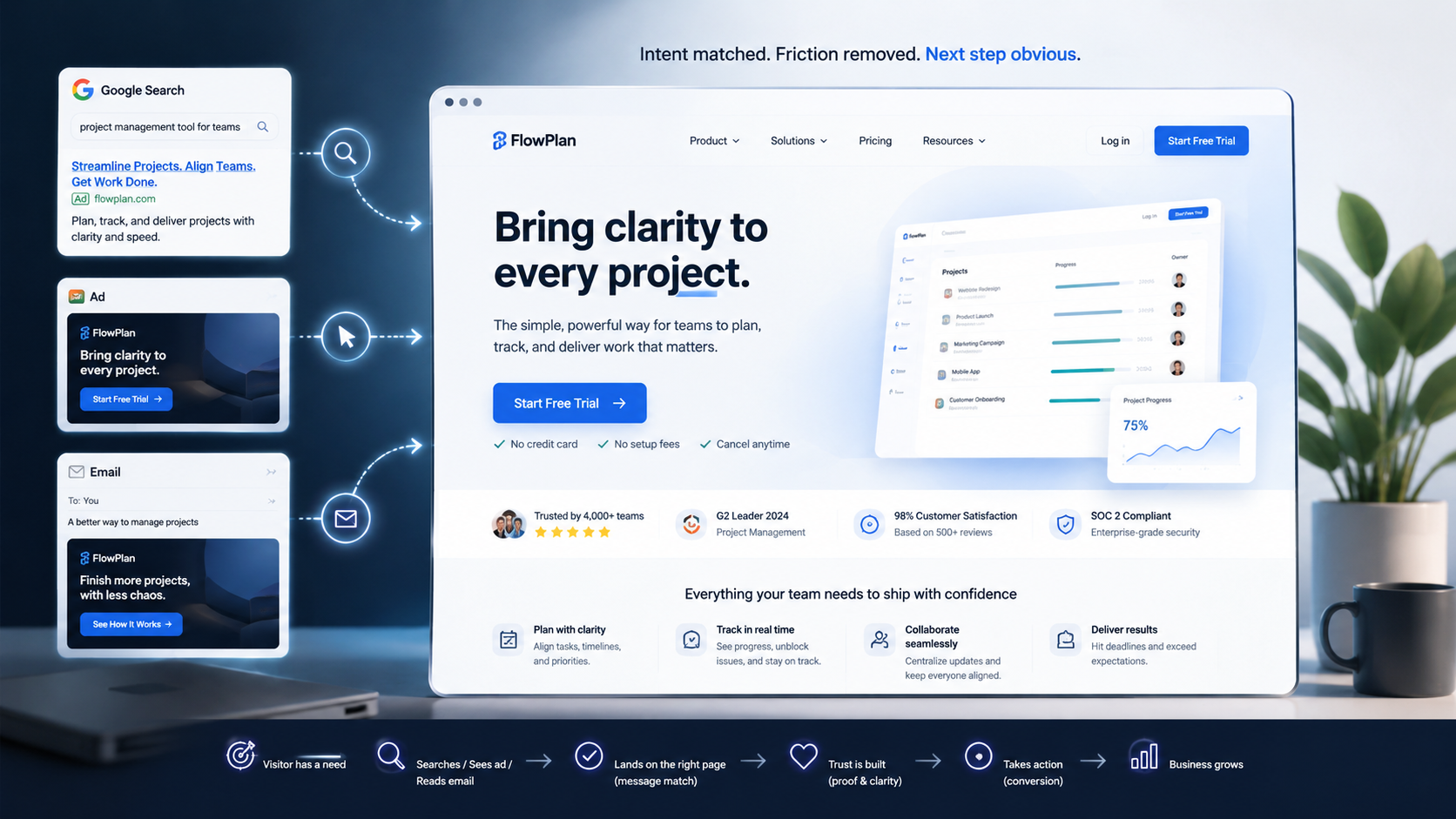
A Website Is a Decision Machine
A business website is not simply a digital brochure. It is a decision machine.
Every visitor arrives with a question, whether they can articulate it or not:
Can this company solve my problem? Do they understand my situation? Are they credible? How much will this cost? What happens if I contact them? Why should I choose them instead of someone else?
The job of the website is to help that visitor move from uncertainty to confidence.
Every confusing headline adds friction. Every vague service description creates doubt. Every slow-loading page tests patience. Every buried call to action increases the odds that a potential buyer leaves without doing anything.
On the other hand, every clear explanation, strong proof point, relevant case study, fast-loading page, useful comparison, and well-placed next step removes friction.
This is why the best websites do not just look good. They guide people.
They make the offer easy to understand. They make the business easier to trust. They make the next step obvious.
Small Conversion Gains Compound Quickly
The economics of a better website can be surprisingly powerful.
Imagine a website gets 10,000 visitors per month and converts 2% of them into qualified leads. That is 200 leads.
If a redesign improves the conversion rate from 2% to 3%, that may sound small at first. But it is not a 1% improvement in business impact. It is a 50% increase in opportunities from the same amount of traffic.
The company did not need more ads. It did not need more impressions. It did not need a larger audience.
It simply made better use of the attention it already had.
That is the compounding power of conversion improvement.
And the impact becomes even greater when the redesign also improves lead quality. A better website can help filter out poor-fit prospects, educate serious buyers, set expectations earlier, and prepare people for better sales conversations.
The result is not just more leads. It can be better leads, shorter sales cycles, fewer repetitive explanations, and stronger close rates.
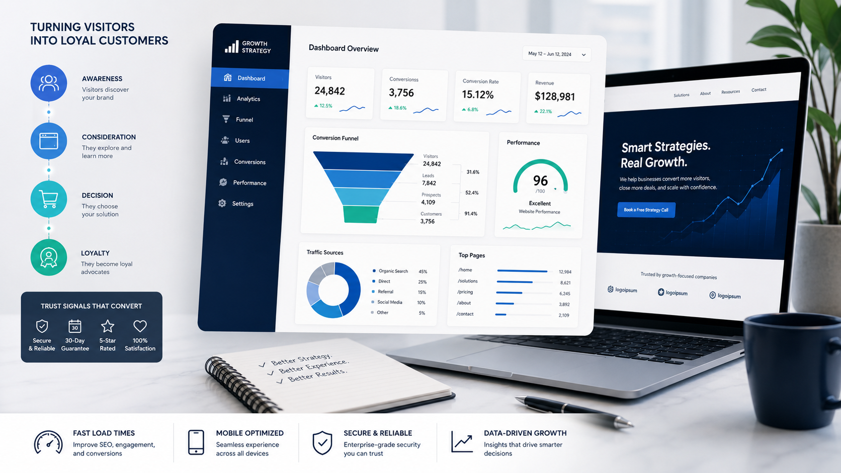
ROI Is More Than Form Submissions
A common mistake is measuring website performance only by contact form submissions. That matters, of course, but it is only one piece of the story.
A strong redesign should look at a broader set of signals.
Are visitors reaching the most important pages? Are they scrolling far enough to see key proof points? Are they clicking calls to action? Are service pages helping people understand the offer? Are organic search visitors landing on pages that match their intent? Are consultation requests becoming more qualified? Are support questions decreasing because the website explains things better? Are sales conversations starting at a more advanced level?
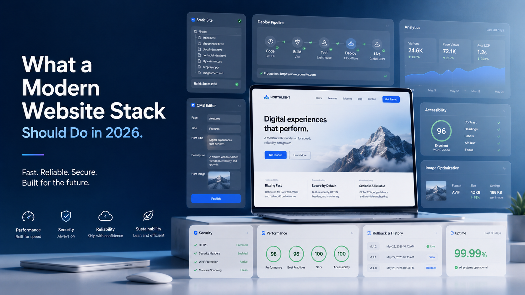
The best redesigns connect design decisions to business behavior.
Page speed is not just a technical metric. It affects patience, trust, and search visibility. Copywriting is not just messaging. It shapes whether visitors understand the value. Navigation is not just structure. It determines how easily people find what matters. Proof is not just decoration. It reduces perceived risk. Calls to action are not just buttons. They are decision points.
When a website is evaluated this way, it becomes much easier to see why design, content, SEO, analytics, and user experience should work together.
What to Improve First
Not every page deserves the same attention at the start.
The smartest redesigns begin with the pages closest to revenue. For most businesses, that means the homepage, service pages, pricing or package pages, proof pages, and contact or booking pages.
The homepage needs to answer the most basic question quickly: what do you do, who do you help, and why should the visitor keep reading?
Service pages need to move beyond generic claims. "We provide IT solutions" or "We help businesses grow" is not enough. Buyers need specifics. What problems do you solve? What outcomes do you create? What does the process look like? What makes your approach different?
Pricing pages, when appropriate, should reduce anxiety. Even if exact pricing is not listed, the page can explain pricing factors, engagement models, starting ranges, or what a buyer should expect.
Proof pages should make credibility tangible. Testimonials are helpful, but named outcomes, before-and-after examples, screenshots, metrics, certifications, partner logos, and specific project details are stronger.
Contact pages should not feel like a dead end. They should explain what happens next. Will someone respond within one business day? Is the first consultation free? What should the visitor include? Who will they speak with?
These details matter because they reduce uncertainty.
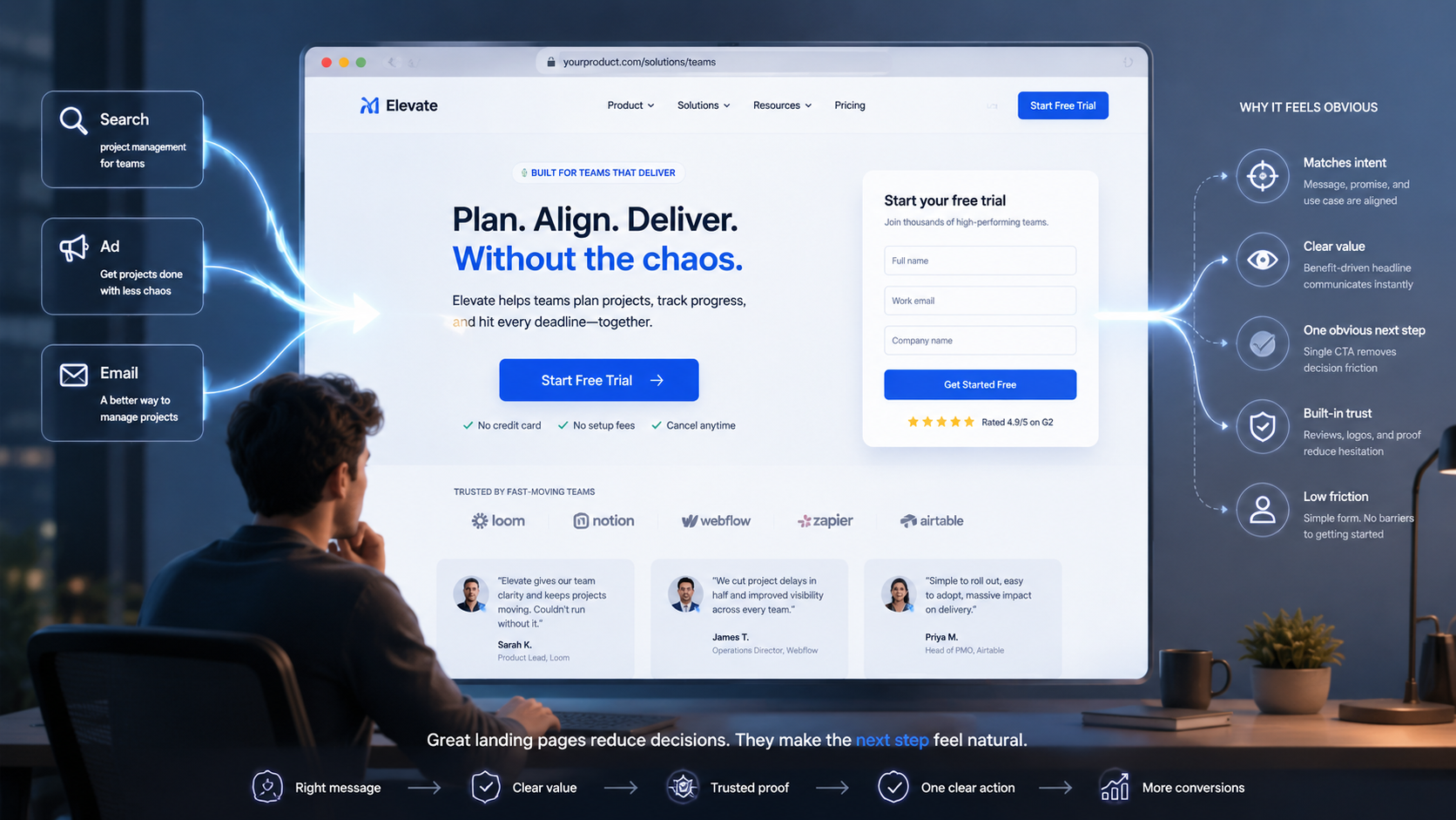
Clarify Before You Beautify
Visual polish works best after the strategy is clear.
Before choosing colors, animations, or page layouts, a business should answer several foundational questions:
Who is the ideal visitor? What problem are they trying to solve? What do they need to believe before they take action? What objections might stop them? What proof would make them feel safer? What next step is realistic based on where they are in the buying journey?
Once those answers are clear, design becomes much more effective.
The layout can emphasize the most persuasive information. The copy can address real buyer concerns. The navigation can match how visitors actually think. The calls to action can feel natural instead of forced. The visuals can reinforce trust rather than simply fill space.
A beautiful site that still leaves visitors guessing is expensive wallpaper.
A useful site creates momentum.
Trust Is Built in the Details
Trust is rarely created by one big statement. It is built through many small signals.
A clear headline tells visitors they are in the right place. A specific service description shows expertise. A real team photo makes the company feel human. A process section reduces fear of the unknown. A useful FAQ answers objections before they become blockers. A case study proves that the business can deliver. Fast performance shows professionalism. Consistent messaging shows focus.
These trust signals are especially important in industries where the buyer is making a high-consideration decision: IT services, cloud consulting, cybersecurity, AI implementation, managed services, software development, professional services, and B2B solutions.
In these spaces, buyers are not just purchasing a product. They are choosing a partner. They are evaluating competence, reliability, communication, and risk.
The website has to do more than look credible. It has to demonstrate credibility.
Better Websites Also Help Sales Teams
One of the most overlooked benefits of a better website is its impact on sales.
A strong website can educate prospects before the first conversation. It can explain services, frame the problem, show proof, answer common objections, and establish expectations.
That means sales teams can spend less time repeating basic information and more time discussing fit, strategy, and next steps.
Instead of beginning every call with, "Here is who we are and what we do," the conversation can start with, "Tell me what you are trying to accomplish."
That is a better use of everyone's time.
A good website does not replace human selling. It improves it.
The Real ROI
The ROI of a better website is not limited to a new look. It shows up in the quality of attention, the strength of trust, and the ease of action.
It shows up when more visitors become qualified leads.
It shows up when buyers understand the offer faster.
It shows up when sales calls are more productive.
It shows up when prospects arrive with better context.
It shows up when the brand feels more credible.
It shows up when search visitors find useful pages that match their intent.
It shows up when fewer people abandon the process because they are confused.
A better website is not just a marketing asset. It is business infrastructure.
And like any good infrastructure, it should make the entire system work better.
The goal is not simply to impress visitors.
The goal is to help the right visitors believe, decide, and act.