Why High-Converting Landing Pages Feel Obvious
The best landing pages do not feel clever. They feel like the next step was designed just for you.
The best landing pages do not feel clever. They feel like the next step was designed just for you.
The best landing pages do not feel clever.
They feel like the next step was designed just for you.
That is usually the first sign a page is doing its job well. There is no friction in understanding what is being offered, who it is for, or what to do next. The visitor lands, scans, and immediately feels oriented.
That feeling matters more than many teams realize.
Because conversion does not begin on the landing page itself. It begins in the moment before the page loads.
Conversion Starts Before the Page Loads
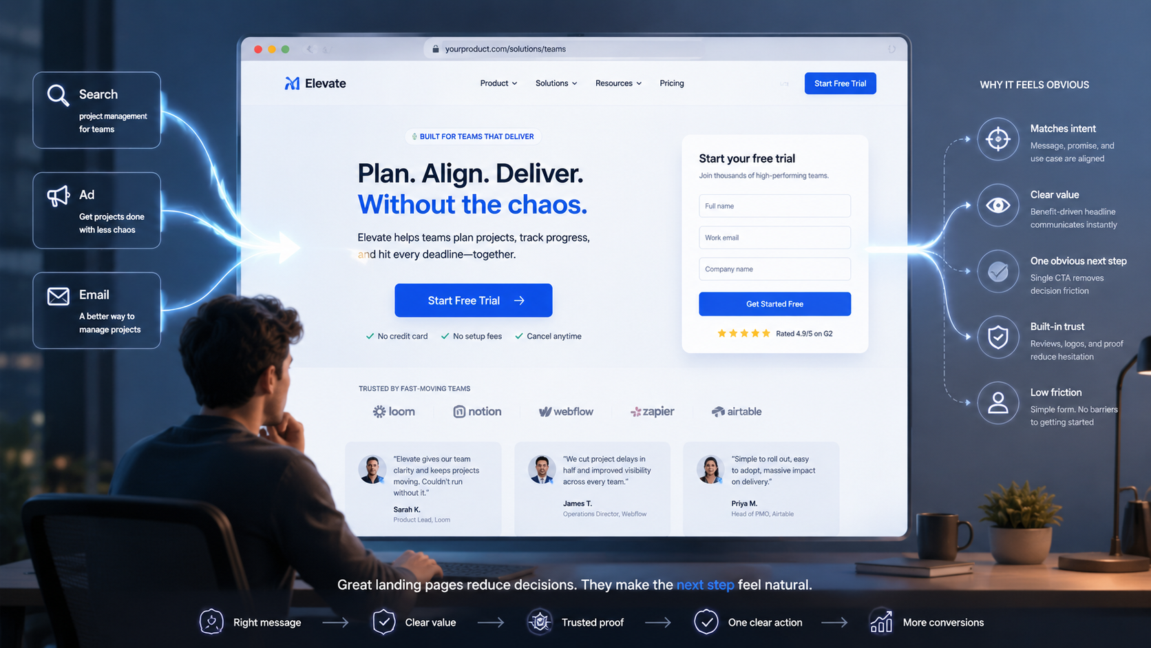
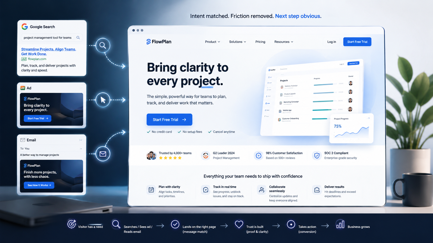
Every landing page inherits intent.
That intent comes from the ad, email, social post, search result, or referral link that brought someone there in the first place. By the time the page opens, the visitor already has a question in their mind, an expectation of what they are about to see, and a level of urgency attached to it.
When the page matches that expectation, the visitor feels like they are in the right place.
When it does not, the visitor has to stop and think.
That is where conversion starts to leak.
A mismatch between source and destination creates immediate cognitive friction. The visitor has to reinterpret the offer, re-evaluate relevance, and decide whether it is worth continuing. Many do not. They bounce not because the design was bad, but because the page made them work too hard to reconnect the dots.
The highest-converting landing pages usually avoid this completely.
They tend to have a narrow promise, a very specific audience, and one dominant action.
They are not trying to be a full website. They are trying to complete a very specific conversation.
That is why the strongest landing pages often feel almost boring in the best possible way. They are not showing off. They are reducing ambiguity.
Good Pages Remove Decisions
A weak landing page asks the visitor to do too much interpretation.
Where do I look first? Which button matters? Is this really for someone like me? What happens if I click? How long will this take? Will I regret giving my email or booking this call?
A strong landing page answers those questions before the visitor consciously asks them.
That is what makes it feel obvious.
The layout should direct attention naturally. The copy should clarify value quickly. The CTA should be unmistakable. The proof should appear close to the moment of hesitation. The form should ask for the minimum viable commitment.
In other words, a high-converting page reduces the number of decisions the visitor has to make.
This is one of the reasons great landing pages repeat themselves more than many designers want to admit. The headline reinforces the promise. The subhead sharpens it. The CTA repeats the next step. The proof reinforces credibility. The process lowers uncertainty.
It is not redundancy for its own sake.
It is reassurance.
That matters because most visitors are not looking for novelty. They are looking for enough clarity and confidence to keep moving.
The Page Should Feel Low-Risk
One of the biggest mistakes teams make is assuming that if the offer is attractive enough, the page can afford to leave unanswered questions on the table.
In practice, a lot of conversion work is really risk-reduction work.
Visitors want to know what they get, how it works, how long it takes, whether it is relevant to them, whether other people trust it, and what happens after they click.
The best pages handle those concerns naturally.
That might mean showing social proof near the CTA, clarifying the next step in plain language, explaining that there is no obligation, using a shorter form, naming the audience directly, or showing a simple three-step process.
None of that is glamorous. But it is effective.
Because conversion usually improves when the next step feels safer, clearer, and easier.
Strong Pages Anticipate Objections
The strongest landing pages do not wait for objections to surface in the sales call or the inbox.
They address them on the page.
That does not mean writing bloated copy or trying to answer every imaginable concern. It means understanding the real friction points and designing the page around them.
For one audience, the objection may be price. For another, it may be trust. For another, it may be relevance. For another, it may be effort.
Good landing pages anticipate that hesitation and place the right proof or explanation close to the moment it matters.
That is why testimonials, trust signals, process explanations, and CTA framing matter so much. They are not decorative elements. They are part of the conversion architecture.
The Page Is Only Half the Funnel
This is another place where teams go wrong.
They treat the landing page like the finish line.
It is not.
A conversion is often just a transition: a call booked, an email captured, a demo requested, a guide downloaded, a quiz started, or a trial opened.
That means the follow-up experience matters just as much as the page itself.
If the page promises clarity but the sales call is vague, trust drops.
If the page promises speed but the follow-up is slow, momentum disappears.
If the page promises a specific outcome but the nurture sequence becomes generic, the funnel weakens.
The best teams understand this. They review landing pages alongside CRM notes, form data, call recordings, and sales outcomes. That is where copy gets sharper. Not from internal brainstorming alone, but from the real language buyers use when they decide.
That is also where obviousness gets refined.
Because what feels obvious to a team is often not what feels obvious to a buyer.
Why Obvious Wins
A lot of weak landing pages are trying too hard to impress.
They want to sound more sophisticated than the buyer needs. They want to say everything at once. They want to be persuasive without first being clear.
But high-converting pages tend to do something simpler.
They make the next step feel natural.
That is what obvious really means in this context.
Not simplistic. Not generic. Not lazy.
Just friction-aware, intent-matched, and easy to act on.
The visitor should not have to decode the offer.
They should feel like the page already understands why they came.
That is usually when conversion happens.
My Takeaway
The best landing pages do not feel clever.
They feel aligned.
They inherit intent well, remove unnecessary decisions, reduce perceived risk, and make the next action feel like the obvious one.
That is why the best-performing pages often feel simpler than expected.
They are not trying to win awards.
They are trying to keep momentum alive.