What Web Design History Teaches Modern Brands
The web has moved from documents to destinations to products. The best sites remember all three.
The web has moved from documents to destinations to products. The best sites remember all three.
The web has moved from documents to destinations to products.
The best modern websites remember all three.
Every era of web design has left behind a lesson. Some lessons are obvious. Others are easy to forget because the tools have changed so much. Today's websites have faster frameworks, better hosting, richer media, responsive layouts, analytics, personalization, content management systems, and sophisticated design systems.
But the fundamentals are still familiar.
People arrive with questions. They look for signals of trust. They decide whether to stay or leave. They want the page to load. They want the next step to be clear. They remember how the experience made them feel.
That is why web design history still matters. It reminds modern brands that a website is not just a visual asset. It is a communication system, a memory system, and increasingly, a product experience.
The strongest brand websites borrow from every era of the web.
They keep the early web's clarity. They borrow the experiential web's atmosphere. They adopt the product web's discipline around performance, usability, and conversion.
When those pieces line up, a website feels both credible and alive.
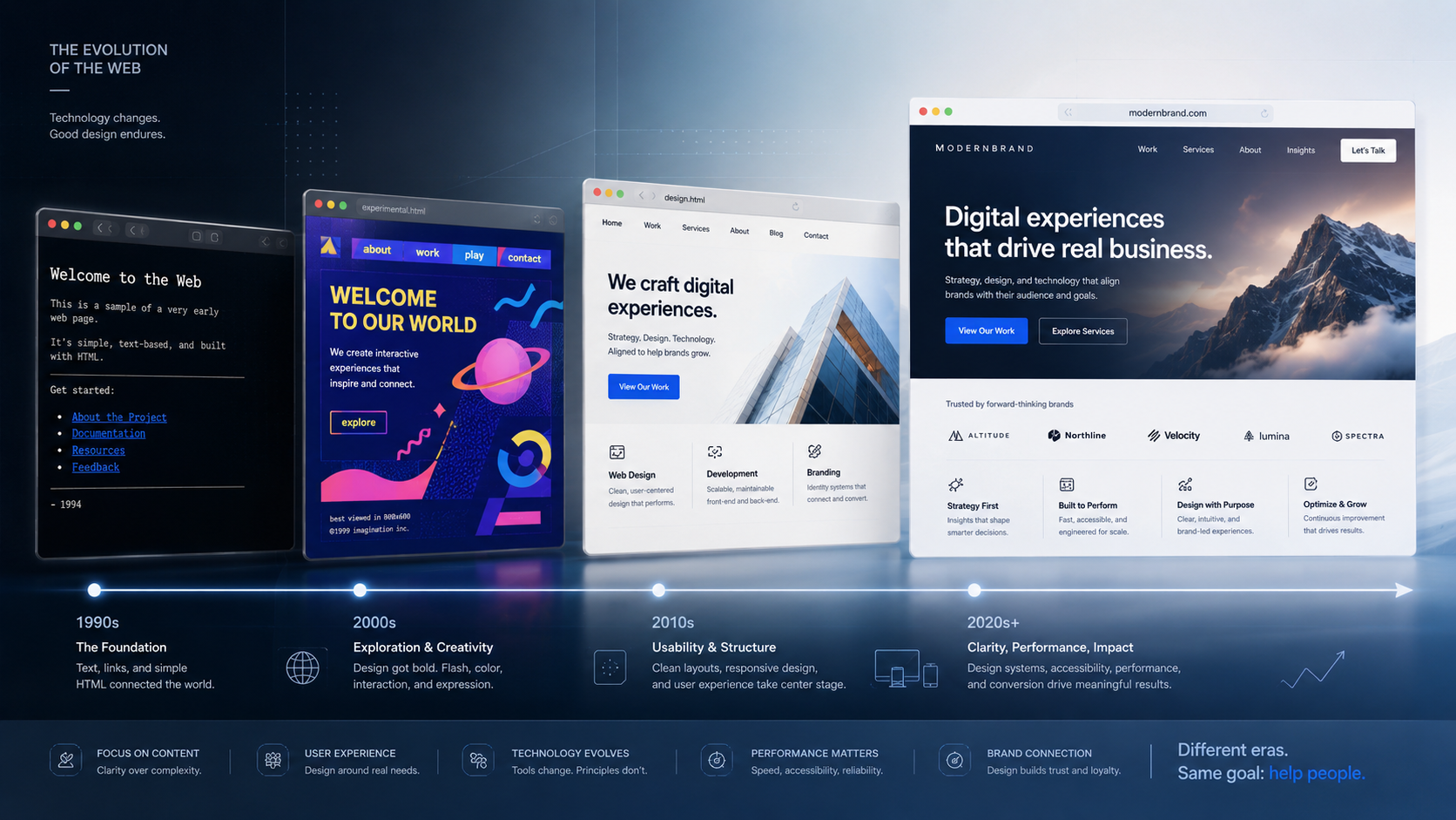
The Early Web Was Radically Practical
The first websites were mostly text, links, and documents.
They were not glamorous. They were not cinematic. They did not have motion design, full-screen video, parallax scrolling, personalized recommendations, or polished component libraries.
But they were often direct.
The structure was visible. The links were obvious. The content was the interface. You could understand what a page was trying to do because there was not much decoration standing between the visitor and the information.
That practicality is worth remembering.
Modern websites sometimes bury their most important ideas under visual complexity. A visitor lands on a homepage and sees a dramatic statement that sounds impressive but says very little. They scroll through animations, abstract illustrations, oversized headlines, and brand language that feels polished but vague.
After thirty seconds, they still may not know what the company does.
That is a problem.
The early web reminds us that clarity is not old-fashioned. It is foundational.
A modern brand website should be able to answer basic questions quickly: what do you do, who do you help, what problem do you solve, why should someone trust you, and what should they do next?
If the site cannot answer those questions, the rest of the design is carrying too much weight.
Structure Is Still Part of the Interface
One of the great strengths of the early web was that structure was obvious.
Pages had headings. Links looked like links. Navigation was straightforward. Content was organized around documents and information. It was not always beautiful, but it was often understandable.
That lesson still matters because many modern sites confuse visual hierarchy with visual drama.
A large headline is not useful if it is unclear. A beautiful section is not effective if it hides the point. A creative menu is not helpful if people cannot find what they need. A clever interaction is not valuable if it interrupts the task.
Information architecture is brand experience.
When a website is easy to navigate, the brand feels more organized. When content is clear, the brand feels more trustworthy. When the visitor can find the right page without effort, the brand feels more competent.
This is especially important for businesses selling complex services: IT consulting, cloud migration, cybersecurity, AI strategy, managed services, software development, financial services, legal services, healthcare, and B2B platforms.
In those categories, buyers are not browsing casually. They are evaluating risk.
Confusing structure creates doubt.
Clear structure creates confidence.
Then Brands Discovered Experience
As bandwidth improved and browsers became more capable, the web became more visual, expressive, and experimental.
Brands began to treat websites as destinations, not just documents.
The Flash era, early microsites, digital campaigns, and experimental agency work pushed the browser into new territory. These sites had motion, sound, immersive navigation, animated storytelling, games, transitions, and brand worlds that felt unlike anything in print.
Some of it aged badly.
Many of those experiences were slow, inaccessible, difficult to update, hard to search, and dependent on technologies that eventually disappeared. Some were beautiful but impractical. Some made users wait through loading screens just to reach basic content.
But that era still taught an important lesson:
Interaction creates memory.
A website does not have to be purely functional to be effective. It also has to be felt.
The best brand experiences create a mood. They communicate personality. They give visitors a reason to remember the company after the tab closes.
That matters because sameness is one of the biggest problems in modern web design.
Many websites today are technically cleaner than older sites, but they often feel interchangeable: the same hero layout, the same gradient blobs, the same three-card benefits section, the same vague call to action, the same stock-style illustrations.
The experiential era reminds brands that character matters.
Character Should Not Come at the Cost of Usability
The lesson from the experiential web is not that every brand needs an immersive cinematic interface.
Most do not.
The better lesson is balance.
A site should have enough character to be remembered and enough restraint to be used.
That means brand expression should support the visitor's journey, not compete with it. Motion should guide attention, not distract from the message. Visual storytelling should clarify meaning, not hide basic information. Creative layouts should still respect accessibility, readability, and performance.
The goal is not to impress visitors with how much the site can do.
The goal is to make the brand easier to understand and harder to forget.
A good modern website can be expressive without becoming exhausting. It can use color, typography, photography, illustration, motion, and interaction to create atmosphere while still respecting the visitor's time.
That is the balance many brands need now.
Not bland utility. Not self-indulgent spectacle. A useful experience with a point of view.
The Product Web Changed Expectations
The next major shift came as websites became more like products.
Search engines, social platforms, SaaS applications, e-commerce systems, media platforms, and mobile apps changed what people expected from the web. Visitors became users. Pages became flows. Interfaces became systems.
This changed brand websites too.
A modern visitor expects speed. They expect mobile usability. They expect clear navigation. They expect forms to work. They expect search to be useful. They expect content to be readable. They expect the experience to feel professional across devices.
A brand site is no longer judged only against competitors in the same industry. It is judged against every good digital experience people use daily.
That is a high bar.
The product web brought discipline to web design: performance matters, accessibility matters, conversion paths matter, content modeling matters, analytics matter, testing matters, component systems matter, and continuous improvement matters.
A website is not just launched. It is operated.
That mindset is essential for modern brands.
A Website Is Now a Living System
Older websites were often treated as fixed projects. Build it, launch it, leave it alone until the next redesign.
That model no longer works.
A modern brand website has to evolve with the business. New services need to be added. Case studies need to be published. Campaign pages need to launch. Search behavior changes. Buyer questions change. Product positioning changes. Analytics reveal weak spots. Competitors improve. Technology expectations rise.
This is why the product mindset matters.
A website should be designed for iteration.
That means content should be easy to update. Components should be reusable. Landing pages should be easy to create. Analytics should show what is working. Forms should integrate with the sales process. Accessibility should be checked regularly. Performance should be monitored. The site should get better after launch, not slowly decay.
The best modern websites are not monuments.
They are systems of improvement.
The Strongest Sites Combine Eras
Each era of the web solved a different problem.
The early web solved access to information. The experiential web solved memorability. The product web solved usability at scale.
Modern brands need all three.
A website with only early-web clarity may be useful but forgettable. A website with only experiential design may be memorable but frustrating. A website with only product discipline may be efficient but emotionally flat.
The strongest sites combine the best qualities of each era.
They are clear enough to understand quickly. They are expressive enough to feel distinct. They are disciplined enough to perform reliably. They are structured enough to support growth. They are flexible enough to improve over time.
This is what modern brand design should aim for.
Not nostalgia. Not novelty. Not conversion tricks.
A complete digital experience.
What Modern Brands Should Learn
The first lesson is that clarity always wins.
No amount of visual polish can compensate for a confusing message. If visitors cannot understand what the business does, who it serves, and why it matters, the site is not doing its job.
The second lesson is that memory matters.
People are unlikely to remember a generic website. Strong brands use visual identity, tone, storytelling, and interaction to create a distinct impression. The site should feel like it belongs to that company and no one else.
The third lesson is that usability is brand perception.
A slow, broken, confusing, or inaccessible website does not merely create a technical problem. It creates a brand problem. Visitors experience friction as a signal. If the site feels careless, they may assume the business is careless.
The fourth lesson is that websites need ownership.
A website is not finished at launch. It needs content updates, performance reviews, security maintenance, analytics review, accessibility improvements, and regular refinement.
The fifth lesson is that restraint is powerful.
Modern tools make almost anything possible. That does not mean everything is useful. The best sites make deliberate choices. They know when to be expressive and when to get out of the way.
Practical Questions for a Modern Brand Site
A brand planning a redesign should not begin with only visual references.
It should ask better questions:
Can a new visitor understand the company in ten seconds? Is the navigation organized around how buyers think? Are the most important pages clear, useful, and credible? Does the site have a distinctive point of view? Does the design support the message or distract from it? Does the experience feel fast on mobile? Are calls to action obvious without being aggressive? Can non-technical teams update important content? Is the site accessible to more users? Can performance, search visibility, and conversions be measured? Will the site be easy to improve after launch?
These questions connect history to strategy.
They remind us that good web design is not just about what is possible now. It is about what has always mattered: communication, trust, usefulness, and action.
The Risk of Forgetting the Past
Every era of web design has produced mistakes.
The early web could be dry and visually inconsistent. The experiential web could be slow, inaccessible, and overdesigned. The product web can become overly standardized, optimized, and emotionally bland.
Modern brands risk repeating all of these mistakes at once.
A site can be visually polished but unclear. Interactive but distracting. Fast but forgettable. Data-driven but soulless. Beautiful but difficult to update. Conversion-focused but untrustworthy.
The answer is not to choose one era as the ideal.
The answer is to understand what each era taught us.
Clarity gives people confidence. Atmosphere gives people memory. Performance gives people momentum.
A strong brand website needs all three.
Final Thought
Web design history is not just a timeline of old technologies and visual trends.
It is a record of changing expectations.
The web began as a place to access information. Then it became a place for brands to create experiences. Then it became a place where users expected speed, utility, personalization, and product-level polish.
Modern brands should not abandon any of those lessons.
The best websites still behave like good documents: clear, structured, and useful.
They still behave like memorable destinations: expressive, atmospheric, and distinct.
They also behave like good products: fast, accessible, measurable, and easy to improve.
When those qualities come together, a website does more than look modern.
It earns attention. It builds trust. It creates memory. It helps people act.
That is what web design history teaches modern brands.